Thursday, October 15, 2015

Trendy Thursday

I thought I would take a few minutes today to put together a post about current trends (or at least what Pinterest says they are)

One of the first ones that caught my eye:
Pineapples and Other Fruit:


I learned on a home improvement show that pineapples have long been a symbol of hospitality, and Wikipedia says this:
"In the Caribbean, Europe and North America, the pineapple became associated with the return of ships from extended voyages, and an emblem of welcome and hospitality that made its way into contemporary art."
So, I love it, but haven't really used it or figured out how to work it into my own decorating or crafting. Have you? If you have, I would love to see an example!

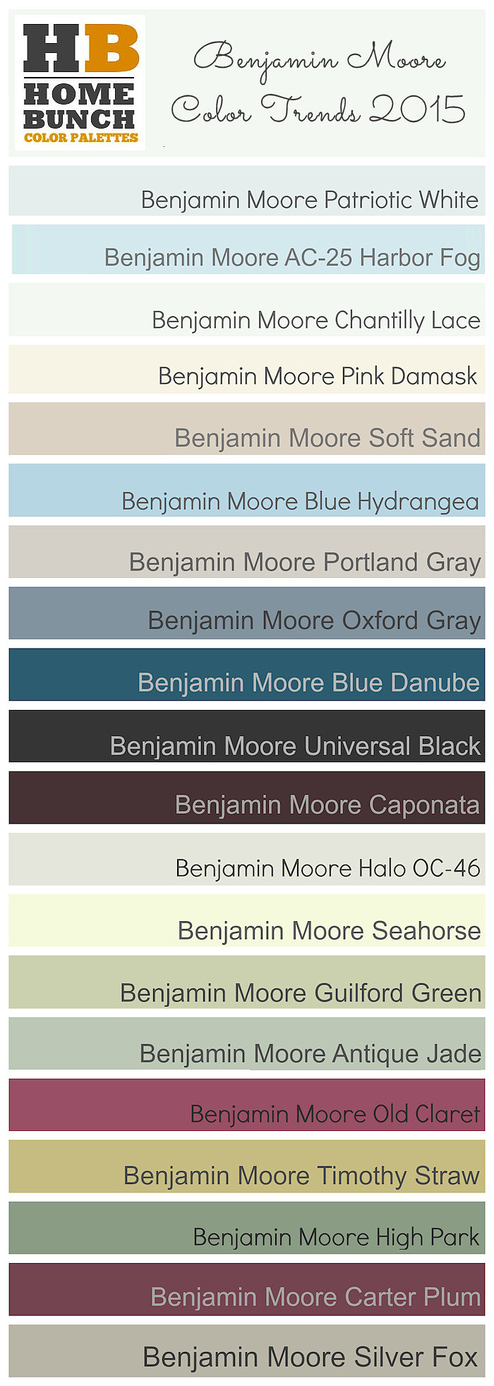
Trending home paint colors:
I love these colors, and used some very similar ones for my own house, when I painted it last year. I love how soft grays can be adapted with a few accent colors and lighting choices. 

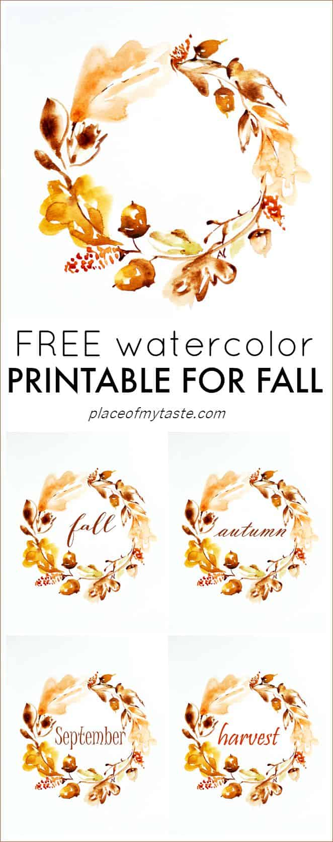
Watercolors:


There are even free printables out there:

What do you think? What trends are you loving right now?

Wednesday, October 7, 2015

Wonderful Wednesday, and a little more scrapbook sharing...

Still working on sharing some of the pages that I have made over the past few weekends. Here are a couple of Disney pages that I made with a past Counterfeit Kit, my August World Traveler kit:

The first layout that I am sharing is a good example of using memorabilia on a layout. I used my mini stapler from American Crafts to attach the "Times Guide" from Hollywood Studios at the top, and I left the bottom loose, so that I could flip it up if I ever wanted to look at the back side.
Of course, it is rumpled from hanging out in my camera bag while we were in the park, but I love that about it! It really makes my page more authentic.

This next page is just a photo of me taken on the carousel at Magic Kingdom, and I love the happy feeling it gives me!

Both pages have many things that I love-colors, paint and splatters of mist, lovely little bits and pieces. What could be a better representation of the happiest place on earth?

Tuesday, October 6, 2015

Two For Tuesday...Scrapbook Style

I have been making a little time to scrapbook on the weekends, so I am working my way through some unfinished projects and kits, and have a little bit to share with you today.
The first layout that I am sharing with you is made from my September "Sweet Citrus" kit,
my paper forgery-you can see a glimpse of it here:

(that I never got around to sharing):

For my paper forgery, I took a soft pink chevron paper from Dear Lizzy, and colored it with an orange Gelato, with I brushed with a bit of water. When it came time to add my photo and embellishments, the orange looked too harsh against the soft pink, so I painted  over most of the background with a soft white wash of paint, before adding the photo, journaling, and embellishments, and love the soft look that it gave to the page. 

The Second layout that I am sharing with you today is a page made up from my April "Fantastic&Fabulous" kit:


The Dear Elsie paper seemed to go perfectly with the "selfie", and girly feel of the page:

And...I am super happy to get some of that OLD stash used up!!

Friday, October 2, 2015

Friday Favorites...Fall Edition

I haven't shared a round up my favorite things off of the web in a while, so here goes:

I have really been loving decorating my home for fall, so fall displays are at the top of my inspiration list:


And these cozy pillows:


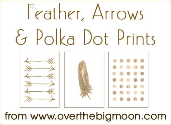
I love these free printables:


And I am really in the mood for fall foods, too!
This Salted Caramel Sauce looks yummy:

What about you? What are you loving this fall?

Thursday, October 1, 2015

October 2015 Counterfeit Kit, "Autumn Breeze"

Welcome to our October Reveal for the Counterfeit Kit Challenge blog! This month, we were given a different bit of inspiration for our kits. We were given this case file from CSI to be inspired by:

I took the color palette, the "evidence", and the "testimony", and pulled together this kit, which I am calling "Autumn Breeze":

Elements in the evidence that are also in my kit:
Leaves-I have leaves in my paper patterns, silk leaves, and sticker leaves, too.
Mist-I have Gold and Peach Color Shine, and Pewter Perfect Pearls spray
Watercolor-I have 3 gelatos to use for this-white, yellow, and orange
Heart- gold glitter hearts and a partially used package of stitched hearts from Amy Tangerine
Metal-I included some small brads from Graphic 45
Scatter something-I included tiny October Afternoon puffy stickers and enamel dots for this prompt
String- vintage coral colored twine
Numbers-canvas number brads from Cosmo Cricket

Thank you for stopping by my blog to have a look at my kit! Here is the list to hop around and see what the other designers are up to.

Tuesday, September 29, 2015

Inspired By Wrapping Paper

Remember this fabulous wrapping paper that was inspiring me?

I decided to take this challenge from CKCB:


Challenge 2: Gift Wrap Challenge:  Find some cool gift wrap and use it to inspire you (perhaps the theme or for your journaling or the patterns)

I combined the challenge with some inspiration gathered in Shimelle's Inspired By Class (specifically, Stephanie Bryan's page), and came up with this layout:
It's a little hard to tell from this photo, but the polka dot paper on this layout is white with gold polka dots from Teresa Collins. I used my "way back machine" to dig a photo out of the archives-and actually scrapped one of my senior photos.

Monday, September 28, 2015

The Great Layout Makeover Challenge

I am here today with this challenge for the CKCB. It was my turn for the next contribution, and it kind of goes against my policy of not redoing my pages, but I'm always up for a challenge, so I powered on. First order of business was to go through my old scrapbook pages/albums, until I saw a page that I thought needed to be redone. I found one from way back in the early 2000s, and decided to go with it.
Here is my original page:
(Please excuse the terrible photo, it was a cell phone snap at night, and I totally forgot to retake the photo before I tore it apart).

Here is what the design team liked:
*the blue color
*the title
*the cute little guy ;-)
*the photos across the page(some felt it was too busy, though)

Suggestions:
*black and white the photos (I chose not to do this simply because they are so busy. I like my black and white photos to be simple and striking)
*having the journaling on a card or tag, and tucking it in somewhere
*use blues-some felt darker, some said lighter blue. The Shimelle True Stories collection was suggested
* bring in some red to tie in the red sweater
*use a square formation for the photos
*trim the photos to eliminate the background
*use Thickers
*use only the three photos on the right
*reduce the photos down to two

I tried to think about all of their suggestions as I was putting my layout back together, although I did have to do it my own way, and include the things that made the page feel complete to me. My favorite part of this challenge: I developed my story more in the process, as I was explaining the layout to the girls, so I included that on my finished layout design.
Would you like to see my finished product?

Here is the updated layout:

I separated the three dancing photos from the other one, which I gave a little more prominence with its own photo mat. I tucked the journaling in on tags, and used a kraft background to ground the photos and the wood tones. I added red as suggested, in bits from Say Cheese, Shimelle's True stories did make a small appearance (can you spot it?), along with a few bits from my September kit. I even got a little bit of light and navy blue in there! What do you think? Better? If you make over any pages, link me up! I'd love to see!

Wednesday, September 16, 2015

Counterfeit Kit Challenge #3:Mix a Sketch

For today's scrapbook layout, I am playing along with the Counterfeit Kit challenge
Challenge #3: Mix the following two sketches together to make a fun, one of a kind project.  You can mix any parts you want, but make sure to use something from each sketch!


I liked the pile of tags and papers in the first sketch, and the squares in the second sketch reminded me of the 6x6 papers that I had in my kit, so this is the layout that I ended up with:
I love how I can still see elements of both sketches, and I love the fun little stack of embellishments and tags, and how I was able to tuck my journaling away!