I am still feeling very inspired by Wilna Furstenberg as I prepare for today's edition of Saturday Scrapbook Stamping. This page was inspired by a layout that she did for her Art and Design workshop at the old Big Picture classes. My page is a little different from Wilna's, but I did want to share what inspired me to get started and go in this direction. I am also using some of the cut files that she included in the class downloads (the die cut title and light bulbs).
This will be an adventure, as I have never stamped with mist before. Won't you come and learn with me?
I started by spraying mist from my April kit into a styro plate:
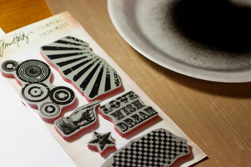
I then selected some stamps-Tim's stamp set should give just the grungy look I want:
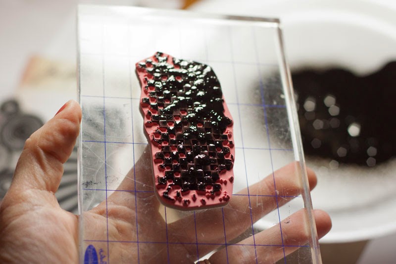
And inked it up. As you can see, the mist pooled quite heavily in some areas:
So I stamped a few times before inking again, and repeated across the center of the page:
I liked the look at this point, but felt like it needed a bit more. So, I dripped the remainder of the mist onto the page:
And this is how it looked when I was finished:
I still wanted a bit more variation, so I gave it a quick shot of mist from about 12 inches above for a fine mist, and then took the nozzle out of the bottle to make few more small drips and splatters with the straw:
*WARNING! Spraying from high above it did cause the mist to over spray my craft mat a little bit!
I liked it at this point, so I let it dry while I did my die cutting, and then mounted it to a sheet of black and white cardstock from my kit:
Now I decided to have a bit of a play with my homemade texture paste:
I wanted it to be yellow, so I dumped some homemade yellow mist (I thought I dumped too much, but it turned out about right):
I mixed it up and added a spritz of Gold Lame as well:
Then I put the light bulbs on the page where I wanted them to be:
And picked them up one cluster at a time, and added a thick layer of the colored paste:
And then set the cut files on top of the paste. After they dried a bit, I pressed them down into the paste a little bit more:
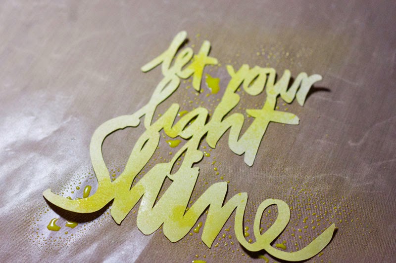
I die cut the title out of a light yellow cardstock scrap, but it was too light, so I decided to mist it with my homemade mist:
There, I like it better already!
I added my photo (after rounding the corners and doing an offset mat on two PL cards from my kit), some scraps, some of the yellow vellum hearts, and some of the black sequins, and a few dabs of Paper Glaze where the light bulbs hadn't adhered completely, adhered the title, and came up with a fun, artsy page, very much inspired by Wilna, that used quite a few bits from my kit, and stamping in a different sort of way!
I hope I inspired you to break out your stamps today!


Inspiring Margie! Love the dotty background on this.Great fun.
ReplyDeleteGreat use of the background stamps and your die cuts for a very Wilna-esque page!!!!
ReplyDeleteThanks, Lisa!
Deleteomg this is gorgeous!!!!!!!! i may need to lift if you don't mind xxx
ReplyDeleteThank you! And lift away!
DeleteAwesome!! How do you add all the medium without warping your paper? I never seem to be able to pull it off. The colors, the depth,....just love this!!
ReplyDeleteThank you! And I found that the heavier the cardstock is, the less it warps. I didn't have any immediate warping, but it did warp some overnight. So, i just put a heavy book on it, and then I will slip it into my album, which is pretty heavy, too, so it should flatten it out!
DeleteAwesome tips and GORGEOUS page! WOW WOW WOW!!!!!!!!
ReplyDeleteThank you, Julie! It was quite fun to make!
DeleteWonderful layout!!! Love the background and the light bulbs.
ReplyDeleteLove just everything about this! Great explanation of your process & I love the idea of getting to use my mists in a different way. Still haven't tried your texture paste recipe, though.
ReplyDelete